Grafana
This page allows the user to watch as data is taken by the experiment over time. It vizualizes data collection over a specified time period, which can be used to indicate noteworthy events like problems or fixes in data collection.
Navigating the Page

A
This is the Experimental hall from which you want to view data.
B
This drop-down bar allows the user to filter for a specified model type (i.e. BCAL, FCAL, ST, etc.).
C
This drop-down allows the user to set a specified date or timeframe from which they want to view data. In this case, data from the begining to the end of January 19, 2023 is being filtered.
D
This drop-down allows the user to refresh the dashboard every specified interval of time. In this case, no interval has been set. A user may decide to intermittently refresh data every if the experiment is actively receiving data.
Reading the Graphs
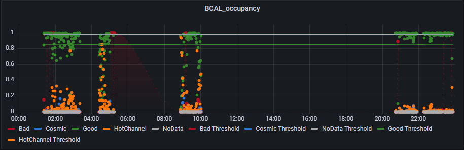
This graph shows data collection over a 24 hour period for “BCAL_occupancy” where Each dot on a graph is a representation of a plot an how it was classified. The x-axis is a specified interval of time, and the y-axis is the confidence of the model’s classification for a plot.
The horizontal colored lines represent threshold values for the different classifications, which are set by the user. A key below every graph indicates what each color means.